How to Create a Home Atmosphere Through Color Matching
The color scheme in home decor is not just a decorative accent but a core element in shaping the overall atmosphere of a space. Different colors can influence our emotions, psychological states, and overall quality of life. By cleverly pairing colors, you can easily create a home that feels cozy, lively, or elegant. Today, let’s explore how to use color combinations to create the ideal home atmosphere.
1. The Psychological Effects of Colors: Understanding Emotional Expression Through Different Hues
Colors play a crucial role in our daily lives; they not only create a visual impact but also influence our emotions and behaviors. Understanding the psychological effects of each color can help us choose and pair them consciously.
Warm Colors (e.g., red, orange, yellow)
Warm tones usually make people feel passionate, energetic, and cozy. Red brings passion and vitality, orange is warmer and more cheerful, while yellow conveys brightness and a sunny feeling. Warm colors are perfect for living rooms, dining rooms, or other spaces with frequent social activities, as they stimulate energy, enhance activity, and foster social interaction. However, too many warm colors can make a space feel overwhelming, so moderation is key.
Cool Colors (e.g., blue, green, purple)
Cool tones typically give a sense of calm, relaxation, and comfort. Blue helps to calm the mind and reduce stress, making it ideal for bedrooms, studies, or other areas where relaxation is a priority. Green, symbolizing nature, gives a fresh, soothing feeling and is great for creating peaceful and tranquil spaces. Purple has a mysterious aura and can evoke a sense of luxury and romance, though too much can make the space feel dull, so it’s best paired with softer hues for balance.
Neutral Colors (e.g., white, gray, black, beige)
Neutral tones are more subdued and versatile, making them easy to pair with other colors. They are well-suited for modern, minimalist, or classic home styles. White gives a clean, tidy feeling and is the foundation for many spaces. Gray is modern and rational, often used as a background or accent color. Black is used more for accents, creating a deep, high-end effect, while beige is a warm neutral that helps create a cozy, inviting atmosphere.
2. Color Matching Schemes for Different Home Atmospheres
Color combinations depend not only on the choice of tones but also on the functional needs and style of the space. By cleverly pairing colors, you can easily shape different home atmospheres, creating cozy, warm, elegant, or lively feelings. Here are some common color schemes to help you create your ideal home environment.
2.1 Cozy and Comfortable Home Atmosphere
To create a warm and comfortable home, choose soft, warm tones. These colors will give the space a relaxed and approachable atmosphere, perfect for family gatherings or everyday relaxation. Colors like light beige, soft orange, and pale pink in the living room or bedroom can bring warmth and enhance comfort and friendliness.
Recommended combination:
- Primary color: Beige, soft pink, warm cream
- Accent color: Orange, light yellow, warm wood tones
- Accessories: Soft fabrics (e.g., blankets, cushions), greenery, wooden furniture, warm lighting
Example:
In a living room with beige as the primary color, pair it with a soft pink sofa and add some orange cushions or yellow flowers to create a cozy atmosphere. Wooden furniture and green plants will add a natural, comfortable touch, enhancing the space’s inviting feel.
2.2 Modern Minimalist Home Atmosphere
Modern minimalist style focuses on functionality and clean lines, often opting for calm, simple neutral tones combined with metallic or black accents. This combination creates a clean, organized space that feels stylish and contemporary, especially suited for urban living. Neutral colors like white and gray as the primary tones bring a fresh visual effect and pair well with modern furniture and decor.
Recommended combination:
- Primary color: White, light gray, dark gray
- Accent color: Black, metallic tones (gold, silver)
- Accessories: Minimalist furniture, glass or metallic decor items, artwork
Example:
In a minimalist study, choose light gray walls, white desks, and dark gray bookshelves. Black metal lamps and a few gold decorations will add a modern, high-end feel. Pair it with minimalist furniture and metal-framed mirrors to create a perfect blend of modernity and simplicity.
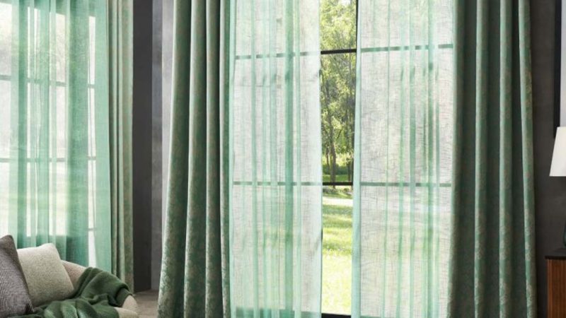
2.3 Natural and Relaxed Home Atmosphere
If you love the natural style and want to bring the outdoors into your home, opt for green and blue tones as primary colors. These colors evoke freshness and calmness, helping you unwind in a busy life. Additionally, pairing natural materials like wood (wooden tables and chairs) and fabrics like cotton and linen can make the home feel closer to nature, creating a relaxed, peaceful environment.
Recommended combination:
- Primary color: Deep green, light blue, off-white
- Accent color: Earthy yellow, wood tones, lime gray
- Accessories: Green plants, natural-textured furniture and decor, linen curtains, bamboo decorations
Example:
In a nature-inspired living room, choose light blue or off-white walls and deep green curtains. Wooden sofas and wicker lamps, along with some green plants, will enhance the natural atmosphere, bringing a calming, nature-filled feeling.
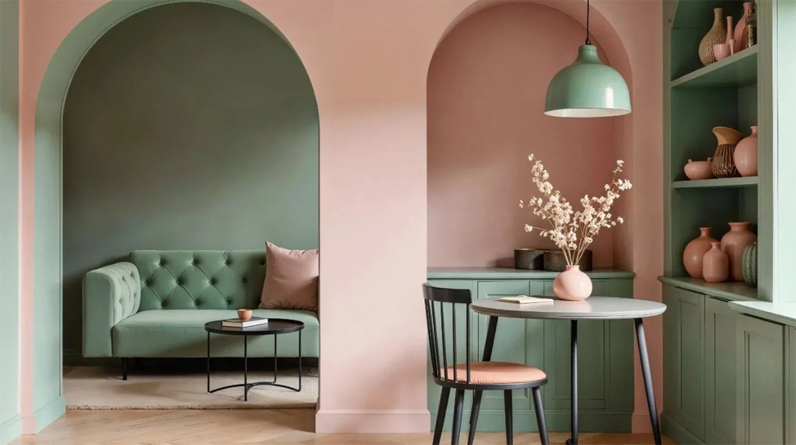
2.4 Romantic and Cozy Home Atmosphere
If you want to create a romantic and warm atmosphere, choose purple, pink, and rose gold tones. These colors have a dreamy and soft feel, making them perfect for bedrooms or small relaxing spaces. The combination of pink and purple creates a warm, elegant feeling. Adding gold or silver accents will elevate the overall effect, making the space more romantic and luxurious.
Recommended combination:
- Primary color: Light pink, lavender purple
- Accent color: Rose gold, gold, off-white
- Accessories: Velvet soft furnishings, warm lighting, romantic decor (e.g., candleholders, beautiful vases)
Example:
In a romantic bedroom, choose light pink or lavender purple for the walls, and pair it with rose gold bedside lamps and decor. Velvet or silk bed linens with soft lighting will create a cozy and elegant atmosphere. Decorative paintings or beautiful flowers can further add to the space’s delicate charm.
3. Practical Tips for Color Matching
In addition to understanding the psychological effects and matching principles of different colors, here are some practical tips to help you use colors more easily to create your ideal home atmosphere. With clever usage, you can create different emotional atmospheres and visual effects in your space.
1. Use Color Layers
Avoid using a single color tone in a space; instead, use color layering to increase richness. Different color layers can give the space more depth and variation, preventing it from feeling flat or monotonous.
- Wall color: Choose soft light tones (e.g., light gray, cream, light beige) for the walls to make the space feel more open and bright.
- Furniture color: Choose slightly deeper neutral tones (e.g., dark gray, dark blue, or wood tones) for furniture to create visual layers.
- Soft furnishings: Use bright accent colors (e.g., royal blue, coral red, or gold) for cushions, curtains, and rugs to break the monotony and add liveliness to the space.
Example:
In a living room with light beige walls, pair it with a gray sofa and add vibrant cushions in orange or gold. This keeps the overall harmony but introduces visual interest with small pops of color.
2. Use Color Proportions
Follow the classic 60-30-10 color rule to achieve balance in your color scheme, avoiding clutter or monotony.
- 60% Primary color: Occupies the majority of the space, usually for walls, floors, and large furniture.
- 30% Secondary color: The secondary tone, used for medium-sized furniture, curtains, or dining tables.
- 10% Accent color: Typically used for decorative items and small accessories, such as flowers, artworks, cushions, and lighting.
When choosing colors, ensure the proportion of primary, secondary, and accent colors is appropriate. A common combination is one primary color, one secondary color, and small amounts of accent colors for vitality.
Example:
In a modern bedroom, the primary color could be light gray, covering 60% of the space, with secondary colors like white or dark gray (30%), and accent colors like gold or green (10%). This ensures the space feels calm yet lively.
3. Consider Lighting Factors
Lighting plays a huge role in how colors appear. Dark colors in poorly lit spaces can make the room feel smaller and more confined, while light colors can make the space feel more expansive and bright.
- In spaces with poor natural light, opt for light tones (e.g., beige, light gray, white) to reflect more light and make the space feel larger.
- In well-lit rooms, you can be bold with deeper tones (e.g., dark blue, charcoal gray, burgundy) to create a warmer, more dramatic atmosphere.
Example:
In a living room with little natural light, use light gray walls and light wood furniture, paired with soft lighting to make the space feel airy. In a sunlit dining room, deep blue or deep green walls will create a deeper, elegant vibe.
4. Color in Small Spaces
In small spaces, color choice is especially important. Light tones and neutral shades make the space appear more open, while dark tones can make a small space feel even more confined. Therefore, in small rooms, the right color pairing can significantly enhance the sense of space.
- Wall color: Choose light tones like white, light gray, beige, or pale blue to make the room feel bigger and more transparent.
- Furniture color: Opt for neutral or light-colored furniture to avoid a heavy feel. If layering is desired, dark furniture can create contrast but should not dominate the space.
- Accessories: Use small, colorful accessories (e.g., vibrant cushions, artwork, rugs) to add personality without taking up too much space.
Example:
In a small study, choose light beige or light gray walls, white or light wood furniture to keep the room fresh and spacious. Add vibrant blue or orange artwork and lighting to introduce personality and depth without overwhelming the space.
4. Color Suggestions for Different Rooms
Each room serves a different function, so the color scheme should be adjusted accordingly. Clever color usage can enhance both the aesthetics and functionality of a room, creating a harmonious and comfortable living environment. Here are color suggestions for different rooms to help you create your ideal home atmosphere.
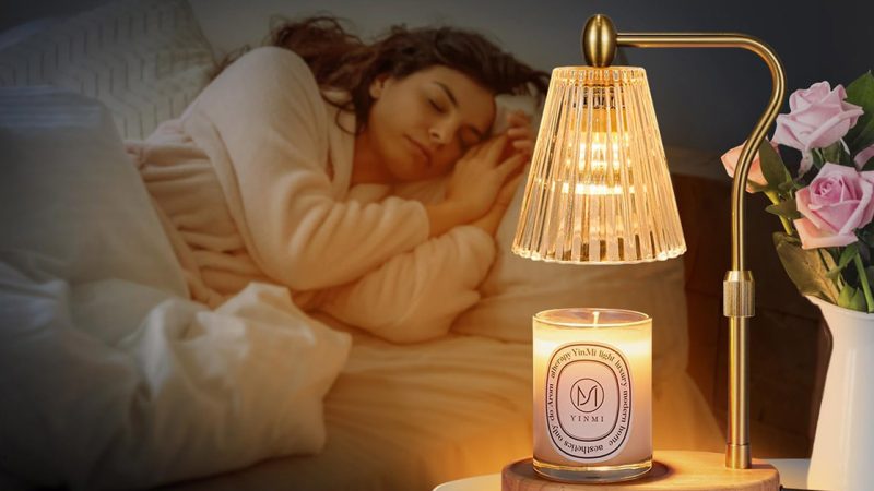
4.1 Bedroom
The bedroom is a place to relax and unwind, so the color scheme should focus on creating a calm, soothing atmosphere. Cool tones and soft colors like light blue, mint green, or lavender purple are great for helping to relax the body and improve sleep quality. Soft neutrals like beige or gray are also suitable for creating a warm, tranquil environment.
Recommended colors:
- Primary color: Light blue, gray, lavender purple
- Accent color: Beige, soft pink
- Accessories: Soft bedding (e.g., velvet or linen), soft lighting, light curtains, plants
Example:
A light blue bedroom with beige bedding and lavender purple cushions creates a calming sleep atmosphere. Soft pink accessories or bedside lamps add warmth, while green plants add life to the space.
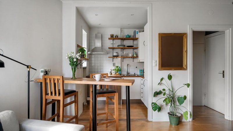
4.2 Living Room
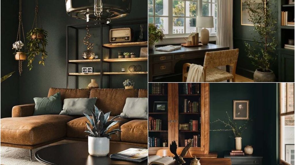
The living room is a place for socializing and family gatherings, so its color scheme needs to reflect warmth, comfort, and liveliness. Warm tones like beige, brown, and warm gray create a welcoming, friendly atmosphere for guests. If you prefer a modern, fresh look, cold tones like gray-blue, deep green, or olive green can add depth and style to the space.
Recommended colors:
- Primary color: Beige, brown, warm gray
- Accent color: Deep blue, olive green
- Accessories: Modern furniture, colorful cushions, metal accents, artwork
Example:
In a warm gray living room, pair it with a beige sofa and deep blue cushions. Metallic lamps and accessories add a modern touch, while green plants bring the space to life.
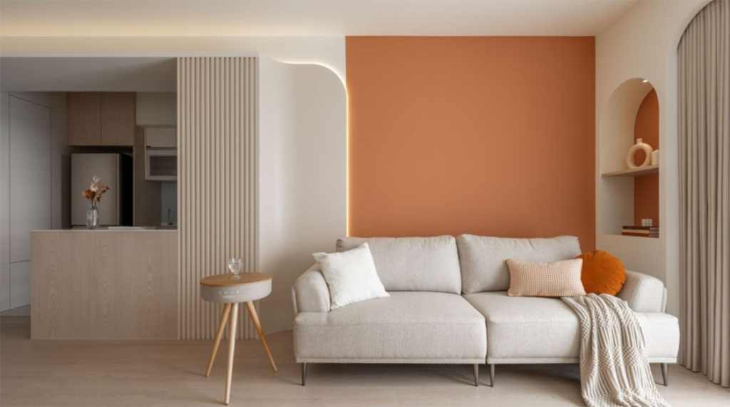
4.3 Dining Room
The dining room is a place for meals and family gatherings, so its color scheme should stimulate appetite while keeping the space clean and refreshing. Warm tones like red, orange, and gold help stimulate the appetite, creating a lively environment. Green and white offer a fresh, pure feeling, making the space feel bright and tidy. Wooden or natural tones also add warmth to the dining room.
Recommended colors:
- Primary color: Orange, red, gold
- Accent color: Green, white
- Accessories: Wooden dining tables, flowers, fine dinnerware, lighting
Example:
An orange dining room can be paired with gold utensils or decor to add elegance. Green plants and white tableware will enhance the freshness, creating a warm yet welcoming dining experience.
5. Color Trends: Home Color Forecast for 2026
With the changing trends in home design, color matching continues to evolve. By 2026, home color schemes will emphasize nature and sustainability, with natural hues and eco-friendly concepts taking center stage. Additionally, color combinations will move away from traditional palettes, embracing bolder clashes and more diverse pairings to infuse personality and energy into the space.
1. The Return of Natural and Sustainable Colors
In 2026, with an increasing focus on environmental protection and sustainable lifestyles, natural colors will dominate home color schemes. Deep greens, olive tones, earth colors, and sandy shades will appear frequently in home design. These colors not only bring a calming, cozy atmosphere but also blend seamlessly with nature, conveying an eco-friendly, back-to-nature philosophy.
Recommended colors:
- Deep green: Symbolizes nature and life, perfect for creating a relaxing, restorative space, especially in bedrooms or studies.
- Olive green: Warm and stable, ideal for living rooms or dining areas, adding a natural, rustic charm.
- Earthy brown: Warm and embracing, suitable for any space as a base tone.
- Sandy beige: A soft, light tone that brings comfort and a natural vibe, ideal for relaxing areas like bedrooms or bathrooms.
- Cold gray: Merging natural elements with modern design, creating a stylish, calm atmosphere, great for minimalist homes.
2. Bold Color Clashes and Personalized Combinations
Apart from the return to natural hues, the 2026 home color trend will feature more bold, contrasting colors and diversified combinations. Bold color clashes not only add visual impact but also inject energy and personality into the home. This trend breaks away from traditional monochrome designs and adds a fresh, creative touch to spaces.
Recommended colors:
- Yellow-orange clash: Combining bright yellow and warm orange brings warmth and energy to living or dining rooms, perfect for lively social spaces.
- Blue-green clash: Mixing calming blue with natural green creates a fresh, vibrant atmosphere, ideal for offices or recreational spaces.
- Pink and cobalt blue: This striking combo will become a highlight in 2026, adding romance and modern flair, perfect for bedrooms or creative studios.
3. Classic Colors in Minimalist Style
Despite the rise of bold and eclectic color schemes, classic minimalist colors will remain timeless. In 2026, minimalist designs will continue to be popular with those who appreciate simplicity and neatness in their homes. Classic colors like white, black, gray, and wood tones will keep spaces clean and bright, especially in fast-paced urban living environments.
Recommended colors:
- White: A basic color in minimalist style, bringing brightness and transparency to any space.
- Black: Adds depth and stability, often used in small accents like light fixtures or frames.
- Gray: Subtle and modern, perfect for any room and pairs well with other colors for a harmonious effect.
- Wood tones: Natural wood hues warm up minimalist spaces, ideal for furniture and flooring.
With clever color combinations, you can elevate the beauty of your home, improving both its functionality and atmosphere. From cozy, warm palettes to modern minimalist designs, to nature-inspired colors and bold clashes, color remains one of the most expressive elements in home design. As we approach 2026, color schemes will be richer and more diverse, offering personalized and creative options to transform your living space into the ideal home.